

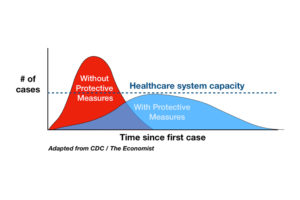
Back in March of 2020, various lockdowns and stay-at-home orders were mandated by state and local governments. With hospitals expected to be soon overrun with cases from a novel virus, the goal was “15 days to flatten the curve” to alleviate load on the healthcare system, as described in this graphic:
None of this ever occurred. The curve was not flattened and hospitals were never overrun. What did happen is that restrictions were extended well beyond 15 days, which still had no positive effect whatsoever.
At the end of the first two weeks of lockdown, I looked at state data on covid cases to see if there were any inflection points where lockdowns had an effect. There were none. Next I waited another two weeks or so to see if there were any inflection points in the state data on covid deaths, as they are lagging indicators. There were none. At that point—due to a lack of correlation—lockdown mandates had proven useless.
But what is meant by an inflection point? In calculus, this is where the second derivative changes sign.[1] The dictionary also defines it more generally:
…I’m looking for somewhere on the graph where government mandates caused a significant “turning point”. Before I do that, let’s explain what inflection points are most important and why.
Turning Points
Everyone who has ever driven a car understands position, velocity (or speed), and acceleration. Position is location at a given time, velocity is the change in position over time, and acceleration is the change in velocity over time. In terms of calculus, velocity is the first derivative and acceleration is the second.
If we talk about an inflection point in your position while driving a car, this is when your acceleration (the second derivative) changes sign, that is, you go from accelerating to decelerating, or decelerating to accelerating. In a graph, this is represented by the change in slope changing direction (or concavity/convexity)
There is another important turning point you care about: when you are going forward vs backward. This is when your velocity (the first derivative) changes sign. In a graph, this is represented by a change from going up to down, or down to up. Strictly speaking mathematically, this is an inflection point in the absement (e.g. integrating the position function), which measures how far away something went and for how long, but since it is visible in the position function, we can call it an inflection point for simplicity.
There is a third important turning point in the position graph, when you pass through origin point. This is when the position function changes sign. Strictly speaking mathematically, this is an inflection point in the absity (e.g. twice integrating the position function), but since it is visible in the position function, we can also call it an inflection point for simplicity.
In summary, given a position graph, we care about the following turning points:
- Changing to/from acceleration and deceleration
- Changing direction
- Arriving at or departing from the origin
Mathematically, all of these are inflection points at some n-th derivative of the position function. All are visible in the graph. All are also understandable to a normal person without the use of mathematical language or knowledge of calculus.
Notice that the turning points above are listed in order from easiest to hardest and the harder require the easier. For example, if you start accelerating your car, you must decelerate before you change direction, and you must change direction before you can arrive back at your origin.
COVID Mandates
So given a graph of covid cases or deaths, how does this correspond to the example above? Perhaps these graphs are best understood by the normal person as analogous to the velocity function above, with the “area under the curve”, representing total cases/deaths (the position function analog). In any case, we care about the following turning points:
- When the cases/deaths per day begins to grow bigger or smaller.
- Change from increasing or decreasing cases/deaths per day.
- If the number of cases/deaths per day falls to zero[1] or the number of deaths per day decreases below zero (resurrection!).
Mathematically, these are all inflection points of some n-th derivative of the case/death function.
The claim of “flatten the curve” would—necessarily—involve one or more of these inflection points. As with the position example above, acceleration/deceleration of cases/deaths must first occur before you can see a change in the direction of cases/deaths per day, and you must see a change in the direction of cases/deaths per day before you can see cases/deaths per day fall to zero.
In short, if mandates worked, we must be able to see that mandates correlate with inflection points in the data. We do not.
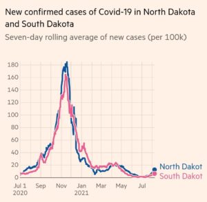
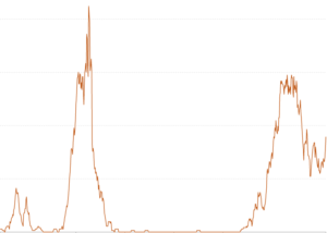
The reality is that North and South Dakota had diametrically opposed covid policies and saw no difference in either shape or magnitude in their covid case graph. There are no inflection points related to mandates. This is so ubiquitous that there are now hundreds of memes like the following that demonstrate this:
Zero-Covid
There is one group of pro-lockdown people who go beyond “flatten the curve” to “zero-covid”. Although we can clearly see that lockdown mandates have no correlation to reducing covid cases/deaths, these people say that lockdowns could eliminate cases/deaths entirely. The elimination of covid by use of lockdowns that does not create an inflection point implies logically…
…that to see covid policy on a case or death per day graph, the slope must be flat (no rise or fall) in response to lockdowns. You’d see no change at all in the graph, which must remain flat, meaning that the lockdowns prevented all cases and deaths. If the lockdowns were only partially effective[2] or the curve was not flat when the lockdowns began, then there must be an inflection point in response to lockdowns. When there are no expected inflection points, so they retort that we didn’t lockdown properly or hard enough or else it would have been enough to stop covid.
This is not falsifiable and is circular reasoning. If you find an example where a lockdown took place, but cases/deaths did not decelerate, then they will say that you didn’t lock down properly. If you find a place where a lockdown took place and cases/deaths stayed flat or decelerated, they’ll take credit for it. It is very nearly impossible to prove the negative: that an action causes something to not occur. If cases/deaths rise, it proves bad lockdowns don’t work. If cases/deaths don’t rise or fall, it proves that good lockdowns work.
Heads I win, tails you lose.
Conclusion
When someone tells you that lockdowns worked, demand to see the inflection points in the data. Give them a blind challenge, like this one:
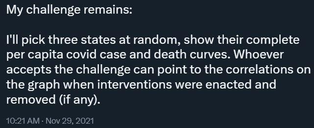
The inflection points don’t exist. Sure, you can randomly cherry-pick some points that seem to indicate that mandates work if you already know what you are looking for while ignoring all the ones that don’t. That’s poor science and you shouldn’t accept it. That’s why a blind challenge is so important. Without assuming the conclusion (circular reasoning), lockdown inflection points are completely absent from the raw data.
Non-pharmaceutical interventions had no noticeable correlation in the raw data. Their impact—if anything—is so small and confounded in the primary data that it takes statistics wizardry even to allege that they are effective at a secondary level. I’ll conclude by showing what a primary effect looks like:
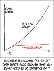
When you have a major inflection point, like in the XKCD graph above, it shows definitive correlation. When you have no correlation at all and have to devise clever statistical means to untangle the underlying signal, it likely means that your signal is very weak, if it exists at all. That’s not good enough for lockdowns. Never has been, never will be.
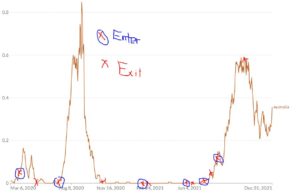
Oh, remember that graph of Australia? You can see for yourself:[3]
[1] Or goes from non-zero to zero before becoming non-zero without changing sign, a “point of undulation”.
[2] Assuming the ineffectiveness was significant enough. A 99% effective lockdown is too close to 100% to be visible outside the statistical noise if and only if the slope was already at zero. Similarly, a 1% effective lockdown is too close to 0% to create a visible inflection point if and only if the slope was already non-zero.
[3] Notice that lockdowns are positively correlated with death more often than they are negatively correlated, that is, entering a lockdown is correlated with an increase in deaths. As a result of chance and selection bias, there is a (likely non-causative) weak correlation.